> ## Documentation Index
> Fetch the complete documentation index at: https://flowdrop.mintlify.site/llms.txt
> Use this file to discover all available pages before exploring further.
# Configuration forms
> Auto-generate node configuration forms from JSON Schema.
FlowDrop automatically generates configuration forms from JSON Schema definitions. This guide covers static schemas, dynamic runtime forms, and layout control.
## Overview
FlowDrop provides three ways to define configuration forms for nodes:
| Approach | When to use |
| ------------------------------------------ | ------------------------------------------------- |
| **Static `configSchema`** | Fields are known ahead of time |
| **Dynamic `configEdit.dynamicSchema`** | Fields depend on external data or user selections |
| **External `configEdit.externalEditLink`** | Configuration is managed by a 3rd-party system |
All three approaches can be combined — FlowDrop tries the dynamic schema first, then falls back to the static schema if the fetch fails.
## Quick Start
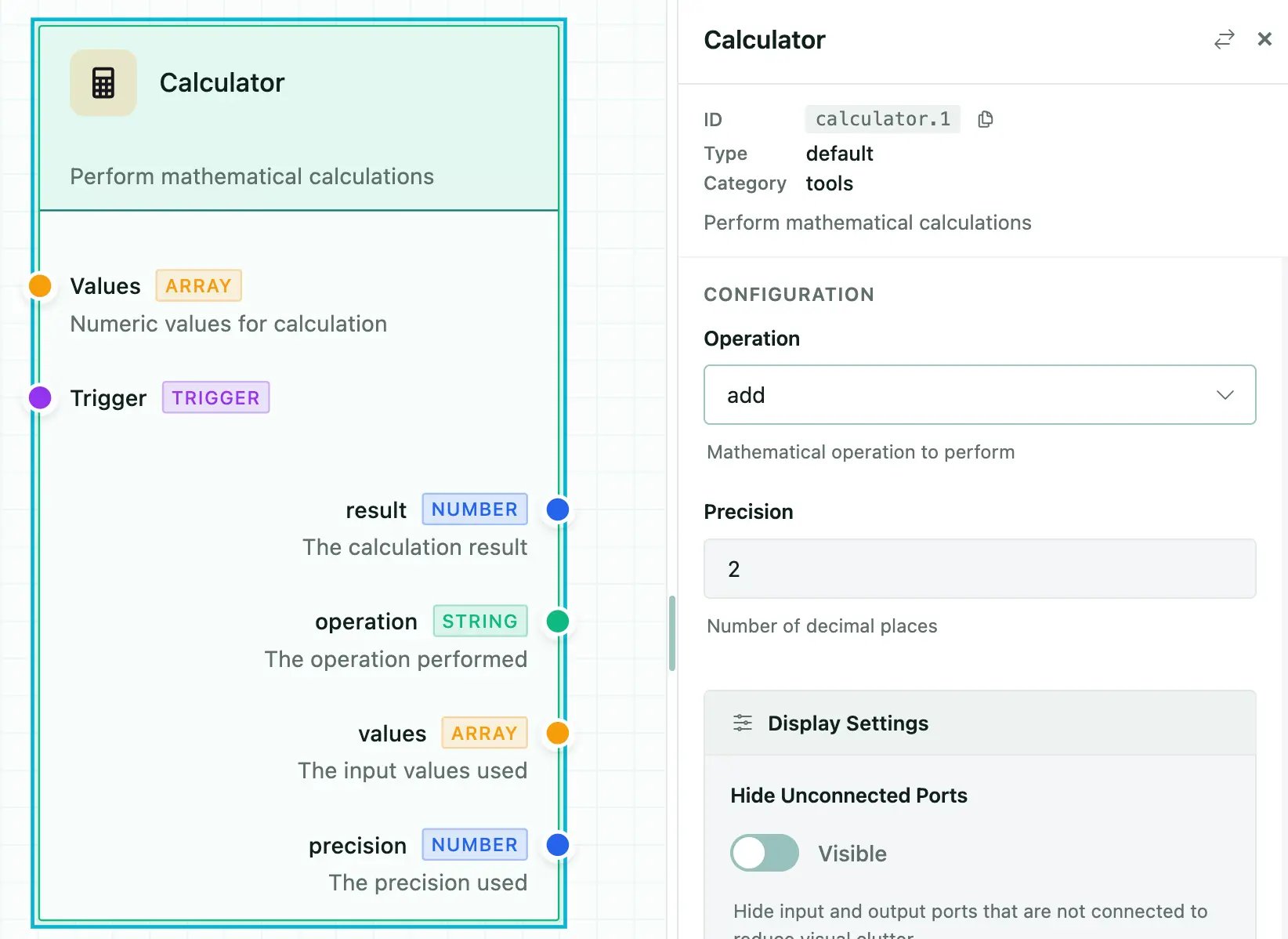
Define `configSchema` on your node metadata. FlowDrop auto-renders the form:
```json highlight={4-32} theme={null}
{
"id": "calculator",
"name": "Calculator",
"configSchema": {
"type": "object",
"properties": {
"operation": {
"type": "string",
"title": "Operation",
"description": "Mathematical operation to perform",
"default": "add",
"enum": [
"add",
"subtract",
"multiply",
"divide",
"power",
"sqrt",
"average",
"min",
"max",
"median",
"mode"
]
},
"precision": {
"type": "integer",
"title": "Precision",
"description": "Number of decimal places",
"default": 2
}
}
},
...
}
```
 ## Field Types and Formats
### Basic Types
| `type` | Renders as |
| --------- | --------------------- |
| `string` | Text input |
| `number` | Number input |
| `integer` | Integer input |
| `boolean` | Toggle switch |
| `array` | Repeatable field list |
| `object` | Nested fieldset |
### Format Overrides
Use `format` to change how a field renders:
| Format | Renders as | Notes |
| -------------- | ------------------------ | --------------------------------------- |
| `multiline` | Textarea | Multi-line text input |
| `hidden` | Nothing | Stored in config but not shown in UI |
| `range` | Slider | Requires `minimum` and `maximum` |
| `json` | CodeMirror editor | JSON syntax highlighting and validation |
| `code` | CodeMirror editor | Alias for `json` |
| `markdown` | Markdown editor | Toolbar and preview |
| `template` | CodeMirror editor | `{{ variable }}` autocomplete |
| `autocomplete` | Text input + suggestions | Fetches options from API |
### Example
```json theme={null}
{
"type": "object",
"properties": {
"prompt": {
"type": "string",
"title": "Prompt",
"format": "multiline"
},
"temperature": {
"type": "number",
"title": "Temperature",
"format": "range",
"minimum": 0,
"maximum": 2,
"default": 0.7
},
"metadata": {
"type": "object",
"title": "Metadata",
"format": "json"
},
"internalId": {
"type": "string",
"format": "hidden"
}
}
}
```
## Select Fields
### Simple Enum
```json theme={null}
{
"model": {
"type": "string",
"title": "Model",
"enum": ["gpt-4o", "gpt-4o-mini", "claude-3"],
"default": "gpt-4o-mini"
}
}
```
### Labeled Options with `oneOf`
```json theme={null}
{
"status": {
"type": "string",
"title": "Status",
"oneOf": [
{ "const": "pending", "title": "Pending" },
{ "const": "in_progress", "title": "In Progress" },
{ "const": "completed", "title": "Completed" }
]
}
}
```
### Multi-Select (Checkboxes)
```json theme={null}
{
"tags": {
"type": "string",
"title": "Tags",
"enum": ["urgent", "review", "archive"],
"multiple": true
}
}
```
## Autocomplete Fields
Fetch suggestions from a remote API as the user types:
```json theme={null}
{
"userId": {
"type": "string",
"title": "User",
"format": "autocomplete",
"autocomplete": {
"url": "/api/users/search",
"queryParam": "q",
"minChars": 2,
"debounceMs": 300,
"labelField": "name",
"valueField": "id",
"allowFreeText": false,
"fetchOnFocus": true
}
}
}
```
## Template Fields
Template fields provide CodeMirror editing with `{{ variable }}` syntax highlighting and autocomplete from connected node outputs:
```json theme={null}
{
"prompt": {
"type": "string",
"title": "Prompt Template",
"format": "template",
"variables": {
"ports": ["data", "context"],
"showHints": true
}
}
}
```
## UISchema Layout
By default, fields render in property order. Use `uiSchema` to control layout and grouping — inspired by [JSON Forms](https://jsonforms.io/):
```json theme={null}
{
"type": "VerticalLayout",
"elements": [
{ "type": "Control", "scope": "#/properties/name" },
{ "type": "Control", "scope": "#/properties/model" },
{
"type": "Group",
"label": "Advanced Settings",
"collapsible": true,
"defaultOpen": false,
"elements": [
{ "type": "Control", "scope": "#/properties/temperature" },
{ "type": "Control", "scope": "#/properties/maxTokens" }
]
}
]
}
```
### Element Types
| Type | Description |
| ---------------- | ----------------------------------------------------------------------- |
| `Control` | Renders a single form field. `scope` is a JSON Pointer to the property. |
| `VerticalLayout` | Stacks child elements vertically. |
| `Group` | Wraps elements in a collapsible fieldset with a label. |
## Special Config Properties
Certain property names trigger automatic behaviors:
| Property | Type | Behavior |
| --------------------- | --------------- | ------------------------------------------------ |
| `instanceTitle` | `string` | Overrides the node's displayed title |
| `instanceDescription` | `string` | Overrides the node's displayed description |
| `instanceBadge` | `string` | Overrides the node's badge |
| `nodeType` | `string` | Switches visual rendering type |
| `dynamicInputs` | `DynamicPort[]` | Creates user-defined input handles |
| `dynamicOutputs` | `DynamicPort[]` | Creates user-defined output handles |
| `branches` | `Branch[]` | Creates conditional output paths (gateway nodes) |
## Dynamic Schema (Runtime)
Use `configEdit.dynamicSchema` to fetch config schemas from your backend at runtime:
```typescript theme={null}
const myNode: NodeMetadata = {
id: 'dynamic-processor',
name: 'Dynamic Processor',
configEdit: {
dynamicSchema: {
url: '/api/nodes/{nodeTypeId}/schema',
method: 'GET',
parameterMapping: {
nodeTypeId: 'metadata.id'
},
cacheSchema: true,
timeout: 10000
},
showRefreshButton: true
},
// Fallback static schema
configSchema: {
type: 'object',
properties: {
apiKey: { type: 'string', title: 'API Key' }
}
}
};
```
The dynamic schema endpoint should return a JSON Schema object. Multiple response shapes are accepted:
* Direct schema: `{ type: "object", properties: {...} }`
* Wrapped: `{ data: {...} }` or `{ schema: {...} }`
* With UISchema: `{ configSchema: {...}, uiSchema: {...} }`
## External Edit Links
For configuration managed by a 3rd-party system:
```typescript theme={null}
configEdit: {
externalEditLink: {
url: 'https://admin.example.com/nodes/{nodeTypeId}/configure',
label: 'Configure in Admin Portal',
icon: 'mdi:open-in-new',
parameterMapping: {
nodeTypeId: 'metadata.id'
},
openInNewTab: true
}
}
```
## Standalone ConfigForm
You can render the `ConfigForm` component independently in svelte projects:
```svelte theme={null}
{
values = config;
}}
onSave={(config) => {
/* persist */
}}
/>
```
## Field Types and Formats
### Basic Types
| `type` | Renders as |
| --------- | --------------------- |
| `string` | Text input |
| `number` | Number input |
| `integer` | Integer input |
| `boolean` | Toggle switch |
| `array` | Repeatable field list |
| `object` | Nested fieldset |
### Format Overrides
Use `format` to change how a field renders:
| Format | Renders as | Notes |
| -------------- | ------------------------ | --------------------------------------- |
| `multiline` | Textarea | Multi-line text input |
| `hidden` | Nothing | Stored in config but not shown in UI |
| `range` | Slider | Requires `minimum` and `maximum` |
| `json` | CodeMirror editor | JSON syntax highlighting and validation |
| `code` | CodeMirror editor | Alias for `json` |
| `markdown` | Markdown editor | Toolbar and preview |
| `template` | CodeMirror editor | `{{ variable }}` autocomplete |
| `autocomplete` | Text input + suggestions | Fetches options from API |
### Example
```json theme={null}
{
"type": "object",
"properties": {
"prompt": {
"type": "string",
"title": "Prompt",
"format": "multiline"
},
"temperature": {
"type": "number",
"title": "Temperature",
"format": "range",
"minimum": 0,
"maximum": 2,
"default": 0.7
},
"metadata": {
"type": "object",
"title": "Metadata",
"format": "json"
},
"internalId": {
"type": "string",
"format": "hidden"
}
}
}
```
## Select Fields
### Simple Enum
```json theme={null}
{
"model": {
"type": "string",
"title": "Model",
"enum": ["gpt-4o", "gpt-4o-mini", "claude-3"],
"default": "gpt-4o-mini"
}
}
```
### Labeled Options with `oneOf`
```json theme={null}
{
"status": {
"type": "string",
"title": "Status",
"oneOf": [
{ "const": "pending", "title": "Pending" },
{ "const": "in_progress", "title": "In Progress" },
{ "const": "completed", "title": "Completed" }
]
}
}
```
### Multi-Select (Checkboxes)
```json theme={null}
{
"tags": {
"type": "string",
"title": "Tags",
"enum": ["urgent", "review", "archive"],
"multiple": true
}
}
```
## Autocomplete Fields
Fetch suggestions from a remote API as the user types:
```json theme={null}
{
"userId": {
"type": "string",
"title": "User",
"format": "autocomplete",
"autocomplete": {
"url": "/api/users/search",
"queryParam": "q",
"minChars": 2,
"debounceMs": 300,
"labelField": "name",
"valueField": "id",
"allowFreeText": false,
"fetchOnFocus": true
}
}
}
```
## Template Fields
Template fields provide CodeMirror editing with `{{ variable }}` syntax highlighting and autocomplete from connected node outputs:
```json theme={null}
{
"prompt": {
"type": "string",
"title": "Prompt Template",
"format": "template",
"variables": {
"ports": ["data", "context"],
"showHints": true
}
}
}
```
## UISchema Layout
By default, fields render in property order. Use `uiSchema` to control layout and grouping — inspired by [JSON Forms](https://jsonforms.io/):
```json theme={null}
{
"type": "VerticalLayout",
"elements": [
{ "type": "Control", "scope": "#/properties/name" },
{ "type": "Control", "scope": "#/properties/model" },
{
"type": "Group",
"label": "Advanced Settings",
"collapsible": true,
"defaultOpen": false,
"elements": [
{ "type": "Control", "scope": "#/properties/temperature" },
{ "type": "Control", "scope": "#/properties/maxTokens" }
]
}
]
}
```
### Element Types
| Type | Description |
| ---------------- | ----------------------------------------------------------------------- |
| `Control` | Renders a single form field. `scope` is a JSON Pointer to the property. |
| `VerticalLayout` | Stacks child elements vertically. |
| `Group` | Wraps elements in a collapsible fieldset with a label. |
## Special Config Properties
Certain property names trigger automatic behaviors:
| Property | Type | Behavior |
| --------------------- | --------------- | ------------------------------------------------ |
| `instanceTitle` | `string` | Overrides the node's displayed title |
| `instanceDescription` | `string` | Overrides the node's displayed description |
| `instanceBadge` | `string` | Overrides the node's badge |
| `nodeType` | `string` | Switches visual rendering type |
| `dynamicInputs` | `DynamicPort[]` | Creates user-defined input handles |
| `dynamicOutputs` | `DynamicPort[]` | Creates user-defined output handles |
| `branches` | `Branch[]` | Creates conditional output paths (gateway nodes) |
## Dynamic Schema (Runtime)
Use `configEdit.dynamicSchema` to fetch config schemas from your backend at runtime:
```typescript theme={null}
const myNode: NodeMetadata = {
id: 'dynamic-processor',
name: 'Dynamic Processor',
configEdit: {
dynamicSchema: {
url: '/api/nodes/{nodeTypeId}/schema',
method: 'GET',
parameterMapping: {
nodeTypeId: 'metadata.id'
},
cacheSchema: true,
timeout: 10000
},
showRefreshButton: true
},
// Fallback static schema
configSchema: {
type: 'object',
properties: {
apiKey: { type: 'string', title: 'API Key' }
}
}
};
```
The dynamic schema endpoint should return a JSON Schema object. Multiple response shapes are accepted:
* Direct schema: `{ type: "object", properties: {...} }`
* Wrapped: `{ data: {...} }` or `{ schema: {...} }`
* With UISchema: `{ configSchema: {...}, uiSchema: {...} }`
## External Edit Links
For configuration managed by a 3rd-party system:
```typescript theme={null}
configEdit: {
externalEditLink: {
url: 'https://admin.example.com/nodes/{nodeTypeId}/configure',
label: 'Configure in Admin Portal',
icon: 'mdi:open-in-new',
parameterMapping: {
nodeTypeId: 'metadata.id'
},
openInNewTab: true
}
}
```
## Standalone ConfigForm
You can render the `ConfigForm` component independently in svelte projects:
```svelte theme={null}
{
values = config;
}}
onSave={(config) => {
/* persist */
}}
/>
```