> ## Documentation Index
> Fetch the complete documentation index at: https://flowdrop.mintlify.site/llms.txt
> Use this file to discover all available pages before exploring further.
# Human-in-the-loop
> Pause workflows for human approval, input, or review.
FlowDrop's interrupt system enables workflows to pause execution and request user input before continuing. This is essential for approval workflows, data collection, decision points, and quality control.
Every interrupt prompt below ships as a live, interactive component. Explore its states, props, and edge cases in [FlowDrop Storybook](https://flowdrop-demo.netlify.app/storybook/).
## Interrupt types
### Confirmation
Simple yes/no prompt for binary decisions:
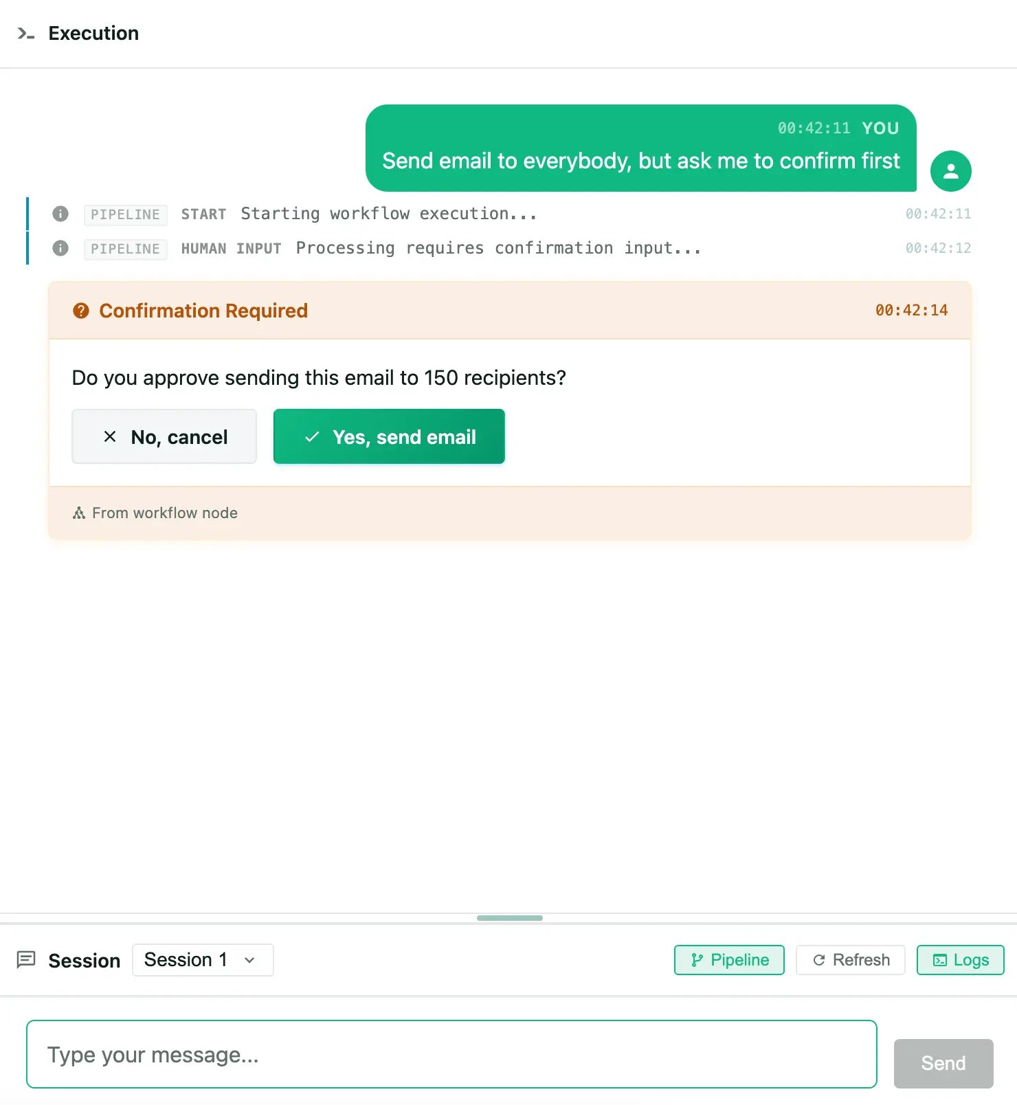 ```json theme={null}
{
"interrupt_type": "confirmation",
"message": "Do you approve sending this email to 150 recipients?",
"confirm_label": "Yes, send email",
"cancel_label": "No, cancel"
}
```
**Response**: `boolean`
Try the confirmed, declined, submitting, and error states.
### Choice
Single or multiple selection from predefined options:
```json theme={null}
{
"interrupt_type": "choice",
"message": "Select the output format:",
"options": [
{ "value": "json", "label": "JSON", "description": "Structured data" },
{ "value": "csv", "label": "CSV", "description": "Spreadsheet format" }
],
"multiple": false
}
```
**Response**: `string` (single) or `string[]` (multiple)
Compare single-select and multi-select variants.
### Text input
Free-form text entry:
```json theme={null}
{
"interrupt_type": "text_input",
"message": "Provide additional context:",
"placeholder": "Enter your notes...",
"multiline": true,
"max_length": 1000
}
```
**Response**: `string`
See single-line, multiline, and length-constrained inputs.
### Form
Complex data entry using JSON Schema:
```json theme={null}
{
"interrupt_type": "form",
"message": "Complete the configuration:",
"schema": {
"type": "object",
"properties": {
"priority": { "type": "string", "enum": ["low", "medium", "high"] },
"notify": { "type": "boolean", "title": "Send notification" }
}
},
"default_values": { "priority": "medium", "notify": true }
}
```
**Response**: `object` (matching schema structure)
### Review
Review proposed field changes with per-field accept/reject decisions and visual diffs:
```json theme={null}
{
"interrupt_type": "review",
"message": "Review these proposed changes:",
"changes": [
{
"field": "title",
"label": "Page Title",
"original": "About Us",
"proposed": "About Our Company"
},
{
"field": "body",
"label": "Body Content",
"original": "
```json theme={null}
{
"interrupt_type": "confirmation",
"message": "Do you approve sending this email to 150 recipients?",
"confirm_label": "Yes, send email",
"cancel_label": "No, cancel"
}
```
**Response**: `boolean`
Try the confirmed, declined, submitting, and error states.
### Choice
Single or multiple selection from predefined options:
```json theme={null}
{
"interrupt_type": "choice",
"message": "Select the output format:",
"options": [
{ "value": "json", "label": "JSON", "description": "Structured data" },
{ "value": "csv", "label": "CSV", "description": "Spreadsheet format" }
],
"multiple": false
}
```
**Response**: `string` (single) or `string[]` (multiple)
Compare single-select and multi-select variants.
### Text input
Free-form text entry:
```json theme={null}
{
"interrupt_type": "text_input",
"message": "Provide additional context:",
"placeholder": "Enter your notes...",
"multiline": true,
"max_length": 1000
}
```
**Response**: `string`
See single-line, multiline, and length-constrained inputs.
### Form
Complex data entry using JSON Schema:
```json theme={null}
{
"interrupt_type": "form",
"message": "Complete the configuration:",
"schema": {
"type": "object",
"properties": {
"priority": { "type": "string", "enum": ["low", "medium", "high"] },
"notify": { "type": "boolean", "title": "Send notification" }
}
},
"default_values": { "priority": "medium", "notify": true }
}
```
**Response**: `object` (matching schema structure)
### Review
Review proposed field changes with per-field accept/reject decisions and visual diffs:
```json theme={null}
{
"interrupt_type": "review",
"message": "Review these proposed changes:",
"changes": [
{
"field": "title",
"label": "Page Title",
"original": "About Us",
"proposed": "About Our Company"
},
{
"field": "body",
"label": "Body Content",
"original": "Welcome to our site.
",
"proposed": "Welcome to our company website.
"
}
]
}
```
**Response**: `ReviewResolution` with per-field decisions and summary counts.
Inspect per-field diffs, accept/reject controls, and many-change views.
## Architecture
```mermaid theme={null}
sequenceDiagram
participant W as Workflow Execution
participant B as Backend
participant F as Frontend
participant U as User
W->>B: Pause & create interrupt
B->>F: Send interrupt request
F->>U: Render prompt
U->>F: Submit response
F->>B: Resolve interrupt
B->>W: Resume workflow
```
## Frontend integration
The `ChatPanel` automatically detects and renders interrupts in messages. For manual integration:
```typescript theme={null}
import { getInstance } from '@flowdrop/flowdrop/editor';
import { InterruptService } from '@flowdrop/flowdrop/playground';
const fd = getInstance();
const interruptService = InterruptService.getInstance();
// Read pending interrupts reactively
const pending = $derived(fd.interrupts.getPending());
// Resolve an interrupt
async function resolveInterrupt(interruptId: string, value: unknown) {
const result = fd.interrupts.startSubmit(interruptId, value);
if (!result.valid) return;
try {
// Pass the instance's endpoint config first
await interruptService.resolveInterrupt(fd.api.config, interruptId, value);
fd.interrupts.submitSuccess(interruptId);
} catch (error) {
fd.interrupts.submitFailure(interruptId, String(error));
}
}
```
## Using prompt components directly
```svelte theme={null}
handleConfirm()}
onCancel={() => handleCancel()}
/>
```
## Backend integration
### Message metadata format
When a workflow requires input, the backend sends a message with interrupt metadata:
```json theme={null}
{
"id": "msg-123",
"role": "assistant",
"content": "I need your approval to proceed.",
"metadata": {
"type": "interrupt_request",
"interrupt_id": "int-456",
"interrupt_type": "confirmation",
"message": "Do you approve this action?",
"confirm_label": "Approve",
"cancel_label": "Reject"
}
}
```
### API endpoints
| Endpoint | Method | Purpose |
| -------------------------------------- | ------ | ----------------------- |
| `/interrupts/{id}` | GET | Get interrupt details |
| `/interrupts/{id}` | POST | Resolve interrupt |
| `/interrupts/{id}/cancel` | POST | Cancel interrupt |
| `/playground/sessions/{id}/interrupts` | GET | List session interrupts |
## State management
The interrupt store uses a state machine with these transitions:
* **idle** — Awaiting user input
* **submitting** — User response being sent
* **resolved** — Successfully processed
* **error** — Submission failed (can retry)
Resolved interrupts remain visible but disabled, showing the user's selection.
## Best practices
1. **Clear messages** — Write actionable prompts ("Do you approve sending this email to 150 recipients?" not "Proceed?")
2. **Meaningful labels** — Use descriptive button labels ("Yes, send email" not "Yes")
3. **Default values** — Provide sensible defaults for form fields
4. **Cancel behavior** — Only set `allowCancel: false` for mandatory interrupts
5. **Error handling** — Always handle resolution failures gracefully