> ## Documentation Index
> Fetch the complete documentation index at: https://flowdrop.mintlify.site/llms.txt
> Use this file to discover all available pages before exploring further.
# Your first node
> Define a node type and see it appear in the editor sidebar.
**What you'll learn**
How to define a node, group it into a category, and pass both to the editor so
it appears in the sidebar.
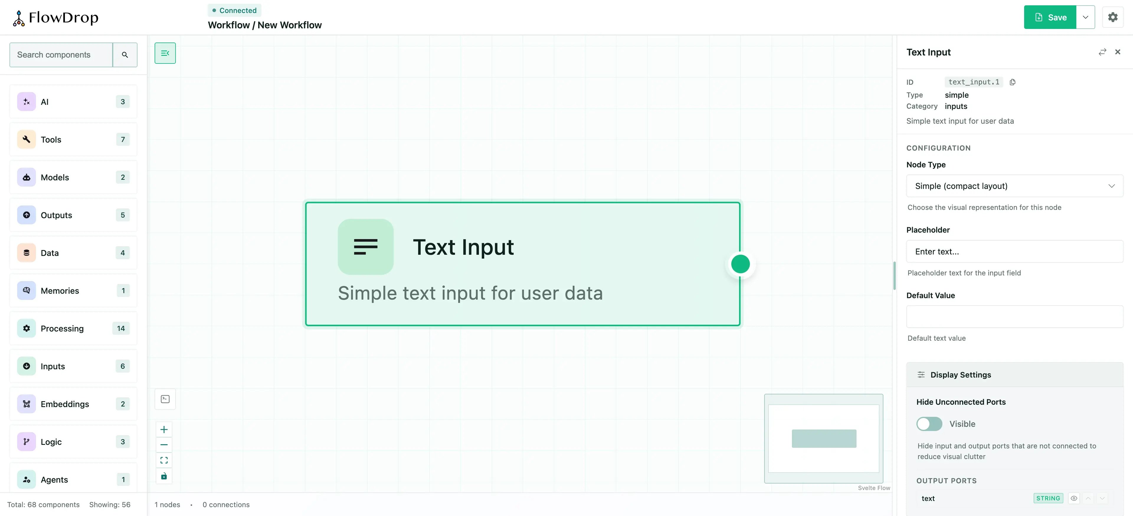
With a single node defined, the sidebar shows a **Text Input** node under the
**Inputs** category. Users can drag it onto the canvas, then click it to see its
configuration form.
## Core concepts
FlowDrop needs two things to populate the sidebar:
1. **Nodes** — definitions of the building blocks users can drag onto the canvas.
2. **Categories** — groups that organize nodes in the sidebar.
### Defining a node
A node is a plain object describing its identity, appearance, and ports:
```js theme={null}
const textInput = {
id: 'text_input',
name: 'Text Input',
type: 'simple', // Visual style: simple, tool, gateway, terminal
description: 'Simple text input for user data',
category: 'inputs', // Must match a category id
icon: 'mdi:text', // Any Iconify icon
color: '#22c55e',
version: '1.0.0',
inputs: [], // No input ports
outputs: [
{
id: 'text',
name: 'text',
type: 'output',
dataType: 'string',
description: 'The input text value'
}
],
configSchema: {
// JSON Schema for the config form
type: 'object',
properties: {
placeholder: {
type: 'string',
title: 'Placeholder',
default: 'Enter text...'
}
}
}
};
```
Key fields:
| Field | Purpose |
| -------------------- | --------------------------------------------------- |
| `type` | Controls the visual style of the node on the canvas |
| `category` | Determines which sidebar group the node appears in |
| `inputs` / `outputs` | Define the connection ports on the node |
| `configSchema` | JSON Schema that generates the configuration form |
### Icons
The `icon` field accepts any [Iconify](https://iconify.design/) icon identifier in `set:name` format. FlowDrop uses [`@iconify/svelte`](https://iconify.design/docs/icon-components/svelte/) to render icons, which loads them on demand from the Iconify API — so you have access to **200,000+ icons** from 150+ open-source icon sets without bundling anything extra.
```js theme={null}
icon: 'mdi:text'; // Material Design Icons
icon: 'heroicons:sparkles'; // Heroicons
icon: 'lucide:bot'; // Lucide
icon: 'ph:brain'; // Phosphor Icons
```
Browse all available icons at [icon-sets.iconify.design](https://icon-sets.iconify.design/).
**Install `@iconify/svelte` to render icons.**
It's an optional peer dependency of FlowDrop; if it's not installed, icons will
not render. See the [Icons reference](/reference/icons) for full details,
including built-in defaults and fallback behavior.
### The `configSchema` and JSON Schema
The `configSchema` field uses [JSON Schema](https://json-schema.org/) — an open standard for describing the structure of JSON data. FlowDrop reads this schema and **automatically generates a configuration form** for each node, so you never need to build form UI by hand.
In the example above, the schema defines a single `placeholder` property of type `string`:
```json theme={null}
{
"type": "object",
"properties": {
"placeholder": {
"type": "string",
"title": "Placeholder",
"default": "Enter text..."
}
}
}
```
This produces a text input labeled "Placeholder" with a default value. You can use any standard JSON Schema features to build richer forms:
| JSON Schema feature | What it generates |
| ------------------------- | ------------------------- |
| `type: "string"` | Text input |
| `type: "number"` | Number input |
| `type: "boolean"` | Toggle / checkbox |
| `type: "string"` + `enum` | Dropdown select |
| `title` | Field label |
| `description` | Help text below the field |
| `default` | Pre-filled value |
**Learn more about JSON Schema.**
The full specification is at [json-schema.org](https://json-schema.org/). The
[Understanding JSON Schema](https://json-schema.org/understanding-json-schema/)
guide is an excellent starting point if you're new to it.
### Defining a category
A category groups related nodes in the sidebar:
```js theme={null}
const inputsCategory = {
id: 'inputs',
name: 'Inputs',
icon: 'mdi:import',
color: '#22c55e'
};
```
The `id` must match the `category` field in your node definitions.
## Mounting with nodes
Pass the `nodes` and `categories` arrays when mounting, along with the `endpointConfig` [from the previous step](/tutorial/02-configuring-endpoints):
```js theme={null}
import { mountFlowDropApp } from '@flowdrop/flowdrop/editor';
import { createEndpointConfig } from '@flowdrop/flowdrop/core';
import '@flowdrop/flowdrop/styles';
const app = await mountFlowDropApp(document.getElementById('editor'), {
nodes: [textInput],
categories: [inputsCategory],
endpointConfig: createEndpointConfig('/api/flowdrop'),
height: '100vh',
showNavbar: true
});
```
## Try it
In your editor:
1. Open the sidebar and drag **Text Input** onto the canvas.
2. Click the node to open its configuration panel.
3. Change the **Placeholder** value — this is generated from the `configSchema`.
 ## What's next
One node is a good start, but workflows need variety. Next, you'll add multiple nodes across several categories to build a full editing experience.
***
**Tutorial — Step 3 of 5**
[← Configuring endpoints](/tutorial/02-configuring-endpoints) · [Next: Nodes & categories →](/tutorial/04-multiple-nodes-and-categories)
## What's next
One node is a good start, but workflows need variety. Next, you'll add multiple nodes across several categories to build a full editing experience.
***
**Tutorial — Step 3 of 5**
[← Configuring endpoints](/tutorial/02-configuring-endpoints) · [Next: Nodes & categories →](/tutorial/04-multiple-nodes-and-categories)