--fd-*), so you can re-skin the entire editor — nodes, sidebar,
toolbar, playground, and dialogs — by overriding a handful of tokens.
Three themes, one editor
FlowDrop ships with three themes out of the box. Each is just a set of--fd-*
token overrides — the same editor, re-skinned. Launch any of them live in the
demo:
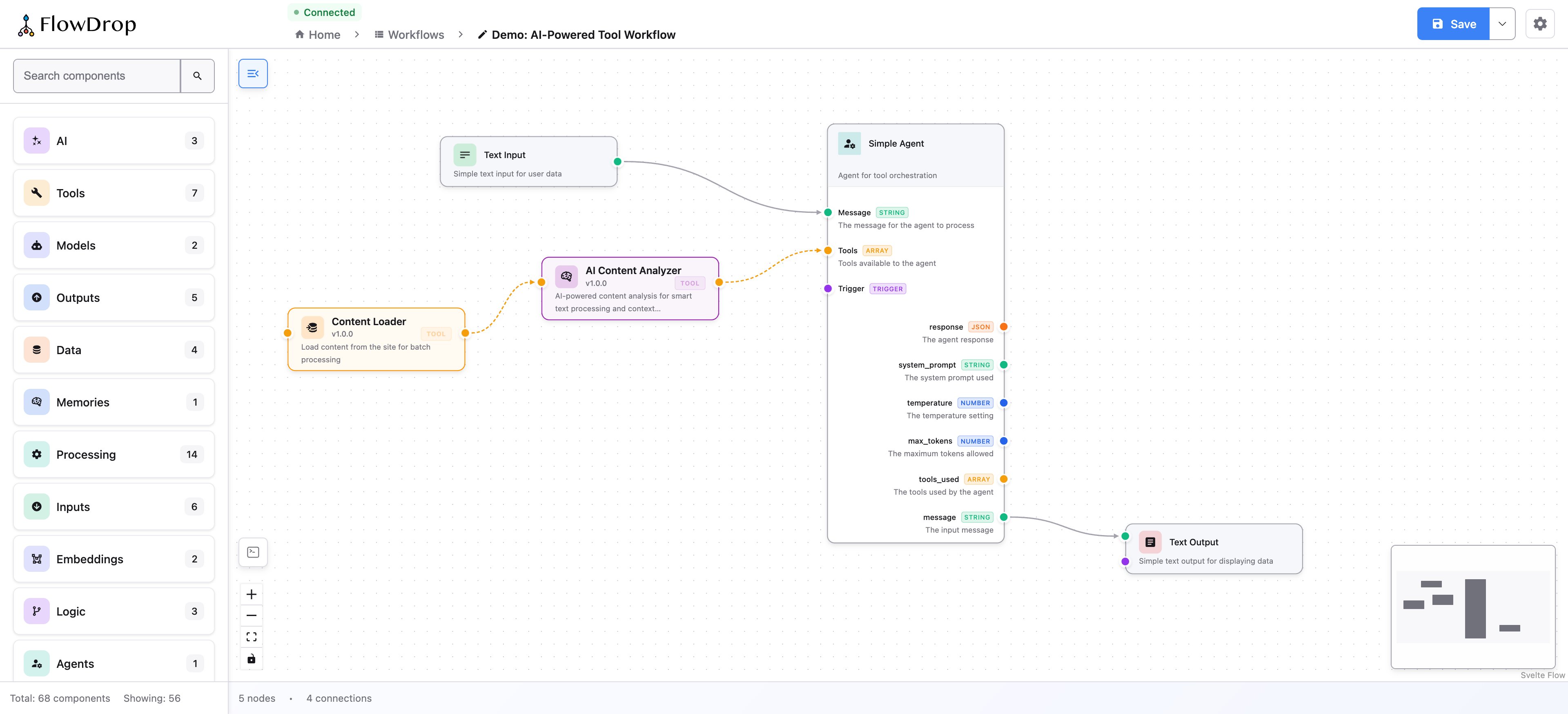
Default
Full chrome and node palette — the standard FlowDrop feel.
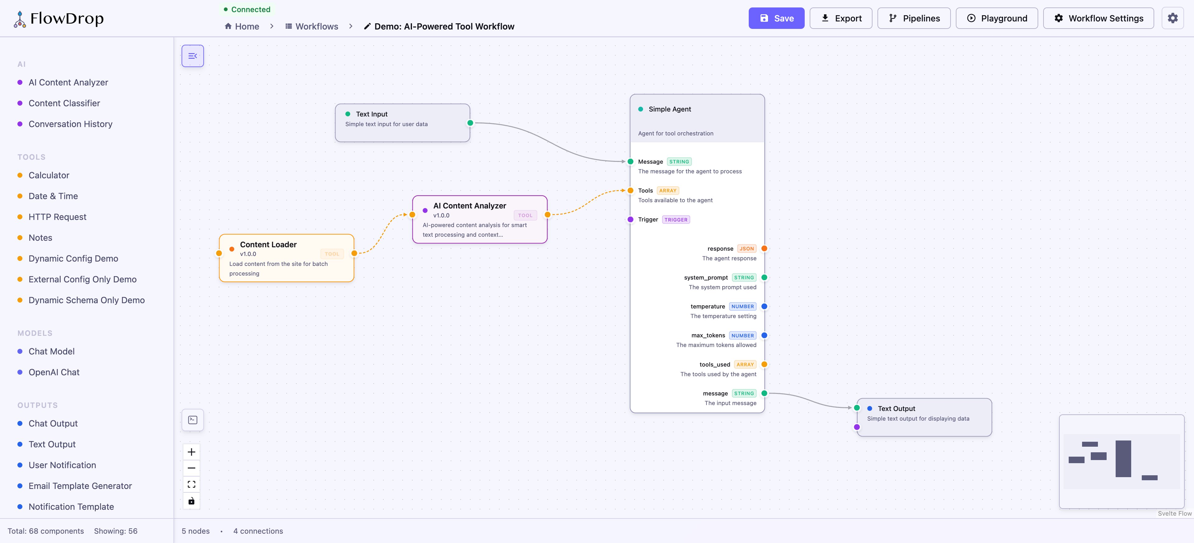
Minimal
Quieter chrome for embedding inside an existing UI.
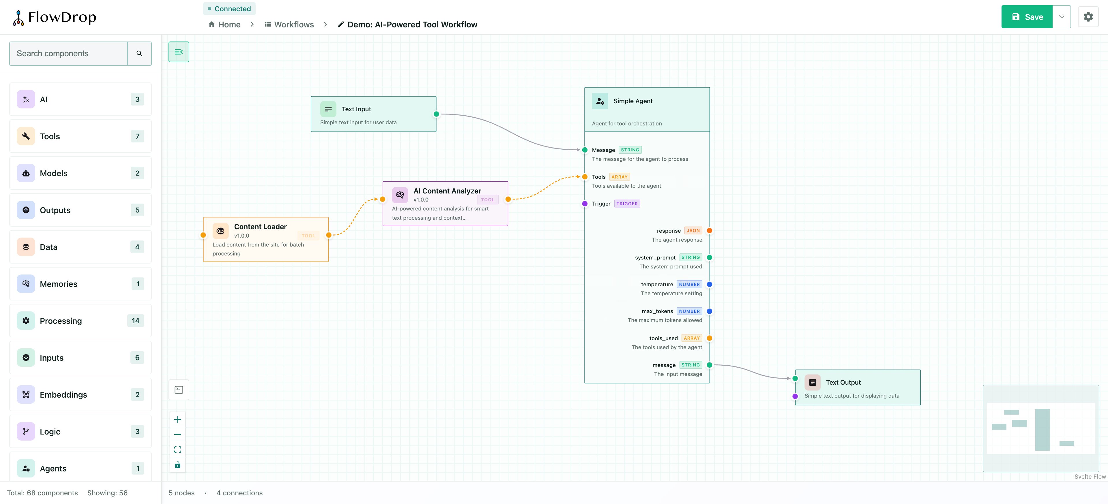
Drafter
A sketch-like, low-fidelity whiteboard skin.
How it works
Themes are just sets of token overrides. Because every component reads from the same--fd-* semantic tokens, changing a token cascades everywhere at once:
data- attribute on a wrapping
element and scoping your token overrides to it:
data-theme="dark".
Go deeper
Theming guide
Full token reference — surfaces, borders, status colors, spacing, radius,
typography, node layout, and ready-to-use theme examples.