FlowDrop automatically generates configuration forms from JSON Schema definitions. This guide covers static schemas, dynamic runtime forms, and layout control.

Overview

FlowDrop provides three ways to define configuration forms for nodes:
ApproachWhen to use
Static configSchemaFields are known ahead of time
Dynamic configEdit.dynamicSchemaFields depend on external data or user selections
External configEdit.externalEditLinkConfiguration is managed by a 3rd-party system
All three approaches can be combined — FlowDrop tries the dynamic schema first, then falls back to the static schema if the fetch fails.

Quick Start

Define configSchema on your node metadata. FlowDrop auto-renders the form:
{
  "id": "calculator",
  "name": "Calculator",
  "configSchema": {
    "type": "object",
    "properties": {
      "operation": {
        "type": "string",
        "title": "Operation",
        "description": "Mathematical operation to perform",
        "default": "add",
        "enum": [
          "add",
          "subtract",
          "multiply",
          "divide",
          "power",
          "sqrt",
          "average",
          "min",
          "max",
          "median",
          "mode"
        ]
      },
      "precision": {
        "type": "integer",
        "title": "Precision",
        "description": "Number of decimal places",
        "default": 2
      }
    }
  },
  ...
}
Config panel showing a form auto-generated from a JSON Schema: text input, number slider, toggle, dropdown select, and multiline textarea fields.

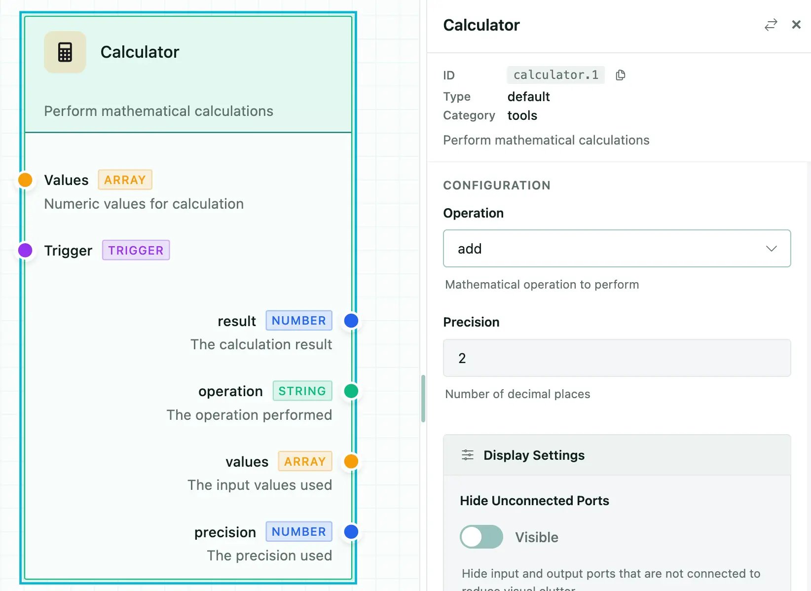
Field Types and Formats

Basic Types

typeRenders as
stringText input
numberNumber input
integerInteger input
booleanToggle switch
arrayRepeatable field list
objectNested fieldset

Format Overrides

Use format to change how a field renders:
FormatRenders asNotes
multilineTextareaMulti-line text input
hiddenNothingStored in config but not shown in UI
rangeSliderRequires minimum and maximum
jsonCodeMirror editorJSON syntax highlighting and validation
codeCodeMirror editorAlias for json
markdownMarkdown editorToolbar and preview
templateCodeMirror editor{{ variable }} autocomplete
autocompleteText input + suggestionsFetches options from API

Example

{
  "type": "object",
  "properties": {
    "prompt": {
      "type": "string",
      "title": "Prompt",
      "format": "multiline"
    },
    "temperature": {
      "type": "number",
      "title": "Temperature",
      "format": "range",
      "minimum": 0,
      "maximum": 2,
      "default": 0.7
    },
    "metadata": {
      "type": "object",
      "title": "Metadata",
      "format": "json"
    },
    "internalId": {
      "type": "string",
      "format": "hidden"
    }
  }
}

Select Fields

Simple Enum

{
  "model": {
    "type": "string",
    "title": "Model",
    "enum": ["gpt-4o", "gpt-4o-mini", "claude-3"],
    "default": "gpt-4o-mini"
  }
}

Labeled Options with oneOf

{
  "status": {
    "type": "string",
    "title": "Status",
    "oneOf": [
      { "const": "pending", "title": "Pending" },
      { "const": "in_progress", "title": "In Progress" },
      { "const": "completed", "title": "Completed" }
    ]
  }
}

Multi-Select (Checkboxes)

{
  "tags": {
    "type": "string",
    "title": "Tags",
    "enum": ["urgent", "review", "archive"],
    "multiple": true
  }
}

Autocomplete Fields

Fetch suggestions from a remote API as the user types:
{
  "userId": {
    "type": "string",
    "title": "User",
    "format": "autocomplete",
    "autocomplete": {
      "url": "/api/users/search",
      "queryParam": "q",
      "minChars": 2,
      "debounceMs": 300,
      "labelField": "name",
      "valueField": "id",
      "allowFreeText": false,
      "fetchOnFocus": true
    }
  }
}

Template Fields

Template fields provide CodeMirror editing with {{ variable }} syntax highlighting and autocomplete from connected node outputs:
{
  "prompt": {
    "type": "string",
    "title": "Prompt Template",
    "format": "template",
    "variables": {
      "ports": ["data", "context"],
      "showHints": true
    }
  }
}

UISchema Layout

By default, fields render in property order. Use uiSchema to control layout and grouping — inspired by JSON Forms:
{
  "type": "VerticalLayout",
  "elements": [
    { "type": "Control", "scope": "#/properties/name" },
    { "type": "Control", "scope": "#/properties/model" },
    {
      "type": "Group",
      "label": "Advanced Settings",
      "collapsible": true,
      "defaultOpen": false,
      "elements": [
        { "type": "Control", "scope": "#/properties/temperature" },
        { "type": "Control", "scope": "#/properties/maxTokens" }
      ]
    }
  ]
}

Element Types

TypeDescription
ControlRenders a single form field. scope is a JSON Pointer to the property.
VerticalLayoutStacks child elements vertically.
GroupWraps elements in a collapsible fieldset with a label.

Special Config Properties

Certain property names trigger automatic behaviors:
PropertyTypeBehavior
instanceTitlestringOverrides the node’s displayed title
instanceDescriptionstringOverrides the node’s displayed description
instanceBadgestringOverrides the node’s badge
nodeTypestringSwitches visual rendering type
dynamicInputsDynamicPort[]Creates user-defined input handles
dynamicOutputsDynamicPort[]Creates user-defined output handles
branchesBranch[]Creates conditional output paths (gateway nodes)

Dynamic Schema (Runtime)

Use configEdit.dynamicSchema to fetch config schemas from your backend at runtime:
const myNode: NodeMetadata = {
  id: 'dynamic-processor',
  name: 'Dynamic Processor',
  configEdit: {
    dynamicSchema: {
      url: '/api/nodes/{nodeTypeId}/schema',
      method: 'GET',
      parameterMapping: {
        nodeTypeId: 'metadata.id'
      },
      cacheSchema: true,
      timeout: 10000
    },
    showRefreshButton: true
  },
  // Fallback static schema
  configSchema: {
    type: 'object',
    properties: {
      apiKey: { type: 'string', title: 'API Key' }
    }
  }
};
The dynamic schema endpoint should return a JSON Schema object. Multiple response shapes are accepted:
  • Direct schema: { type: "object", properties: {...} }
  • Wrapped: { data: {...} } or { schema: {...} }
  • With UISchema: { configSchema: {...}, uiSchema: {...} }
For configuration managed by a 3rd-party system:
configEdit: {
  externalEditLink: {
    url: 'https://admin.example.com/nodes/{nodeTypeId}/configure',
    label: 'Configure in Admin Portal',
    icon: 'mdi:open-in-new',
    parameterMapping: {
      nodeTypeId: 'metadata.id'
    },
    openInNewTab: true
  }
}

Standalone ConfigForm

You can render the ConfigForm component independently in svelte projects:
<script>
  import { ConfigForm } from '@flowdrop/flowdrop/editor';

  const schema = {
    type: 'object',
    properties: {
      name: { type: 'string', title: 'Name' },
      email: { type: 'string', title: 'Email' }
    },
    required: ['name', 'email']
  };

  let values = $state({});
</script>

<ConfigForm
  {schema}
  {values}
  onChange={(config) => {
    values = config;
  }}
  onSave={(config) => {
    /* persist */
  }}
/>